Friday, June 18, 2010

Textures

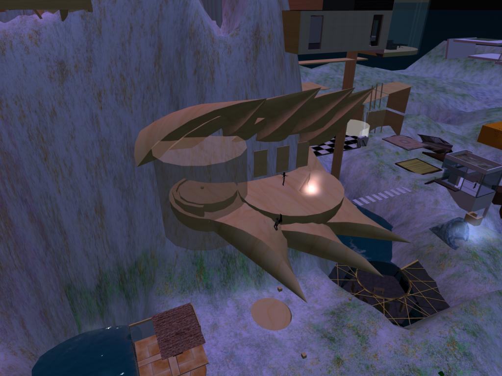
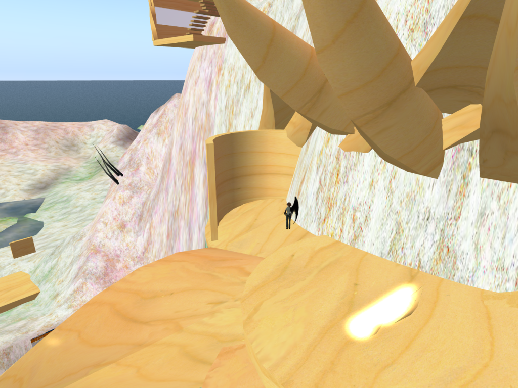
Started working with textures, and below are the screenshots of the textures I tried. I used existing second life ones, to see what I could do in terms of repetition and aesthetic, also so I could save some money, and see what kind of textures look good and where. I first changed textures, repetition and shape in the enclosed space, and then started looking at the whole structure.


The dark iterations were quite nice, however, did not really fit with the structure in general. The checkered patterns gave a nice aesthetic, and I decided to stay with it.


Interesting effect here - I increased horizontal repetition, and reduced vertical repetition, causing this stripe effect to occur.
Changing the shape also changed the pattern. I liked how as a sphere, it was darker towards the main office, and lighter towards its surroundings. Creating a barrier between the space and the main office, and having a nice view to the outside (although when you're inside, the sphere is invisible to you anyway).

Started looking at structure colour and textures. Used multiple wood textures here, including the default texture, which is the first photo.


After going through all the iterations, I thought that the texture colours were too dark, and I actually preferred the default texture. Thus, I'm going to import lighter textures to experiment with in the structure.

Thursday, June 17, 2010

Be gone!

The enclosed space rezzer finally worked, and here are the photos to show the steps.

Enclosed space shown in the left side of the office, the transparency allowing light to filter in, and marking off clear boundaries to the rest of the office. Initially made the rezzer, so that it could summon this sphere which would enclose the office area from outside people, to give a sense of privacy.
Within the enclosed space with a friend. The good thing about this enclosed space is that people on the outside cannot zoom in on objects placed on the table, because of the limits of secondlife, the avatars would be zooming up on the sphere itself, therefore preventing most of the information being place in the sphere.
Zooming out of the sphere a bit.
Looked at using a cylindrical shape for a enclosed space. It looked nice, but I preferred a circular shape, because the base was a sphere.

Sculpted shape. Quite liked how it was irregular, and also resembled a sphere in a way. The dent in the middle reminded me of a skylight of some sort, allowing more light to go through the top of the enclosed area.
Looking at how the office area shape interacted with the office.


The above 2 screenshots look at the office with and without the enclosed area. I thought that they fitted quite nicely with the office, and also these two were supposed to show me turning the enclosed space on and off using the commands: "shield" to bring up the sculpted shape, and "noshield" to remove it. However, the snapshots did not show the UI with the picture.

Wednesday, June 16, 2010

Addition of a Wall

Decided that I would add a cylindrical wall to the secondary circle on the far side of the office. Initial idea was that this would be the office space where you would be able to talk to people, away from the space which was closely linked to the public air space. The wall here is quite high, and I decide to make it smaller in the picture below.


Looking afar at the office, looking how the wall fits in. I thought that it linked the top and the bottom quite well. I changed it to night lighting so that it wasn't so hard on the eyes to look at, and also looking with night lighting has nice contrasts in colour.
Added places for the posters to be put up. Decided to lean it against the wall, so that your back isn't against the wall when you look at it. (This would screw up your camera controls and view, I wanted to move away from that as much as possible). However, with that reasoning, I looked at my office space again. It had a huge wall around most of it, and I found that it was quite hard working the camera controls to be comfortable to it. Therefore, I decided to shorten the height of the wall, and made it a seating place. The photos below show the changes I made. I decided that if private talks were to be made, this space could be shut off with maybe a sphere that is summoned, and could enclose the area. However, the rezzer was not working today, but will be worked on tommorow.

Tuesday, June 15, 2010

Re-looking the Office

Started reworking, because I realised that the structure was not really the cones that contributed to it( there was a platform). I removed the platforms, and re-looked at the whole office.

Reason I placed a platform previously was because the surface was uneven, so to improve the experienced, I made a flat floor. I decided to fill up the hollow shapes of the cone, so that a smoother walk through the structure could be achieved.


Looked at placement of the cones.


Decided to use a larger cone to enable more space. Even though the small cones were 10x10x10m, in the end, only a little amount of space would be used comfortably (due to the cone shape going smaller at the ends).
Started moulding the base.

Finished the prelimary base of the structure.

Added a fourth cone to the base structure.

The fourth cone would jut out from the mountain, and leave this awful gap. To solve this problem, I decided to add a cone, to continue the movement coming out of the mountain.

Decided to continue the hemisphere idea along the mountain, to have this grand feeling of an office floor.
Decided to make the hemisphere larger, and on the same angle to the smaller hemisphere. I chose to use the bigger space as a large viewing space, and the small hemisphere to be used as a small office.

Made the hemisphere on a different angle, to reveal the underneath of it, making the space well defined.
Re-did the roofs, the old cones were too small to reflect the space and were placed in a pattern
Added a fourth cone to the top, and also added the cone which links to this blogsite on touch.
Different view.

Wednesday, May 19, 2010

Table and chair additions

Added a bigger circular floor for consistent navigation around the office.
Added a big circular seat so that anyone can be within the meeting. Also easier to use a bigger seat rather than using separate seats - uses a lot of prims.

Added a table to suggest it actually is a workspace.


Coloured the table to attract attention, and also added an object so that people can find my blog just by clicking it(script that prompts the avatar to view a website).

Added texture and glow effect to the middle cone, and also sat in a different spot to illustrate that you can sit anywhere in the circular seat.